WIDACTIC
Widactic is a start-up that is developing new digital solutions with the aim of facilitating learning methods and renewing training courses.
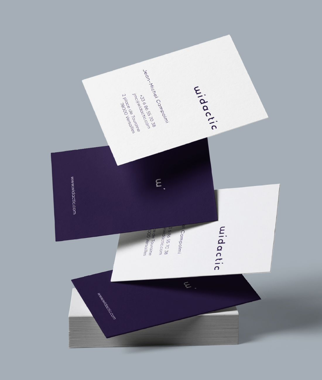
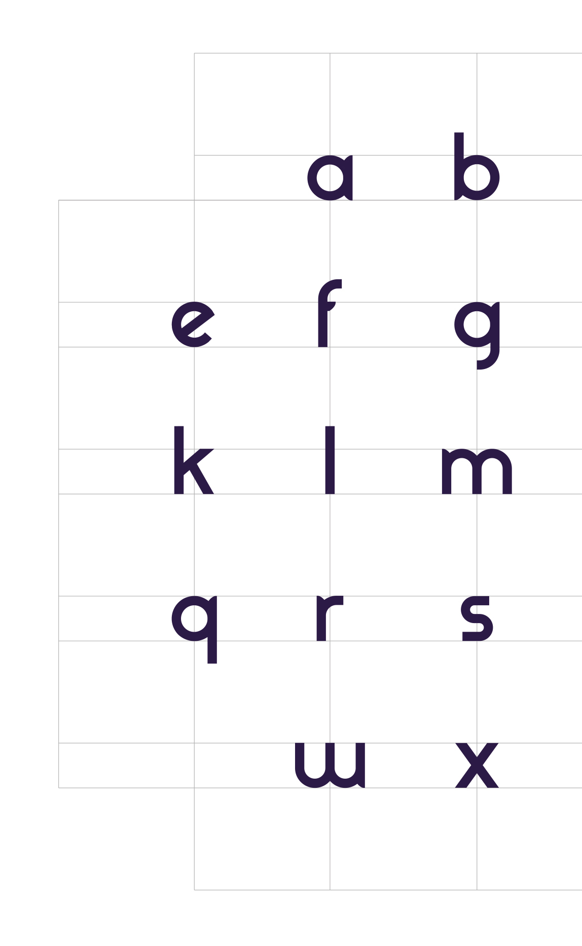
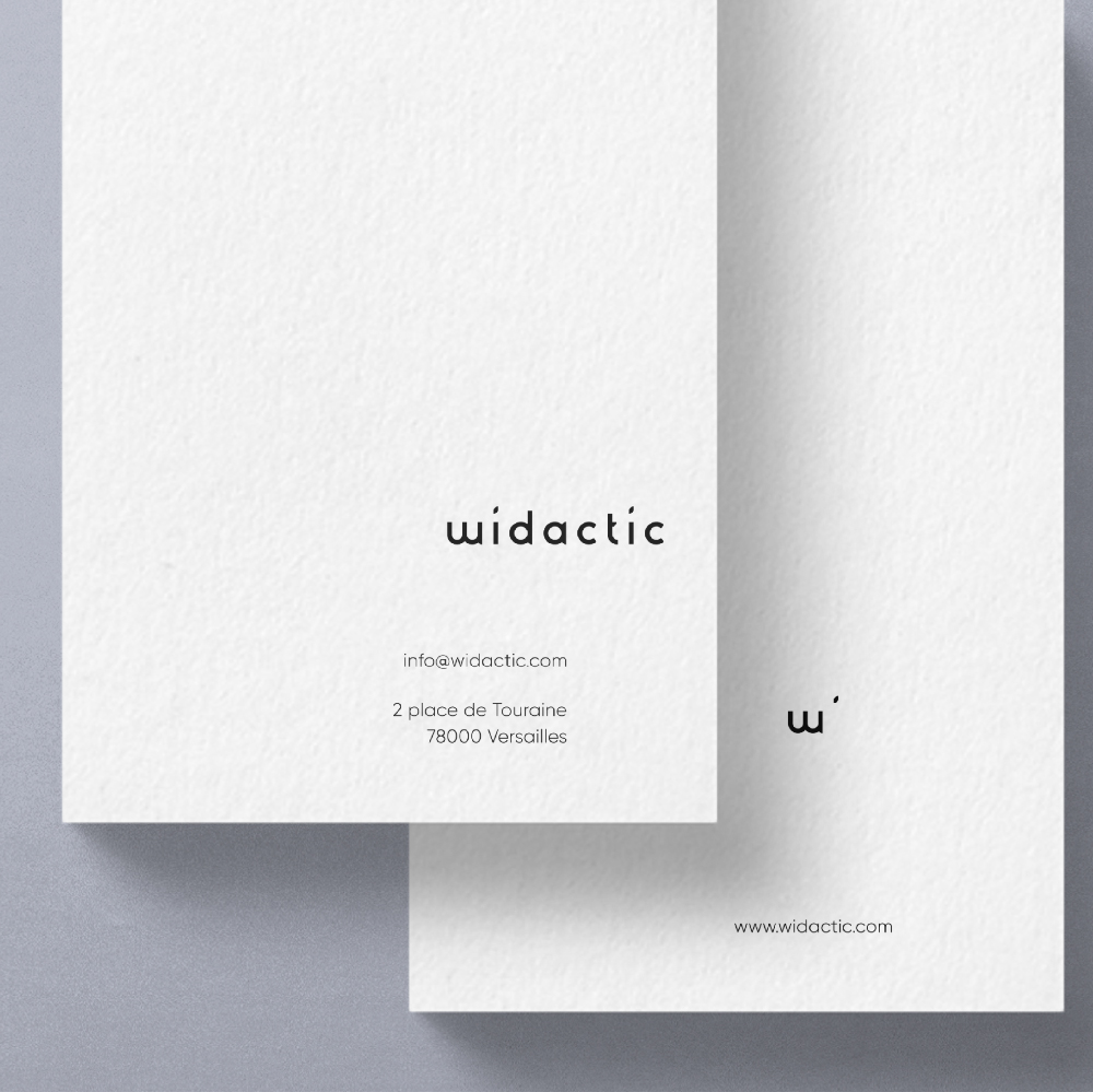
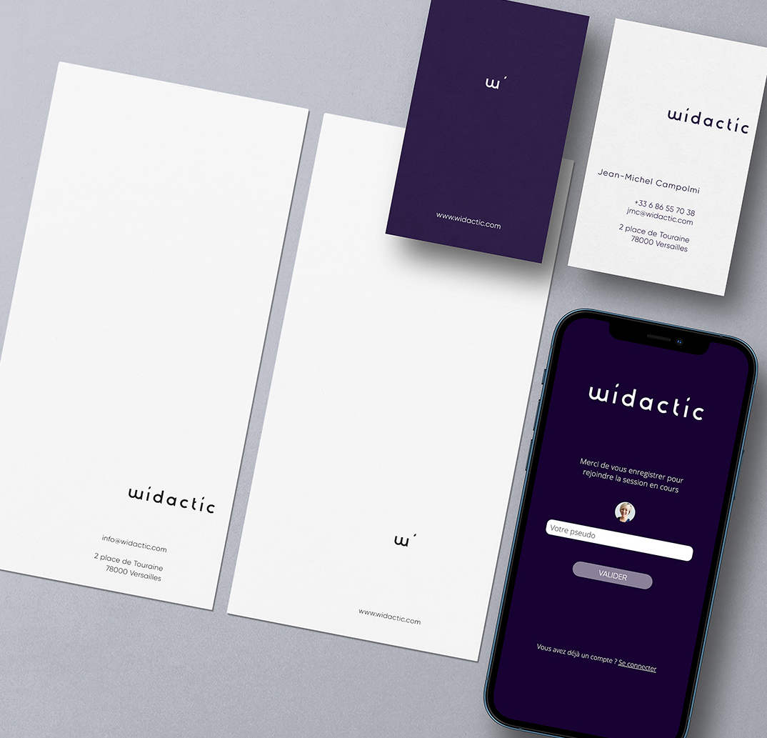
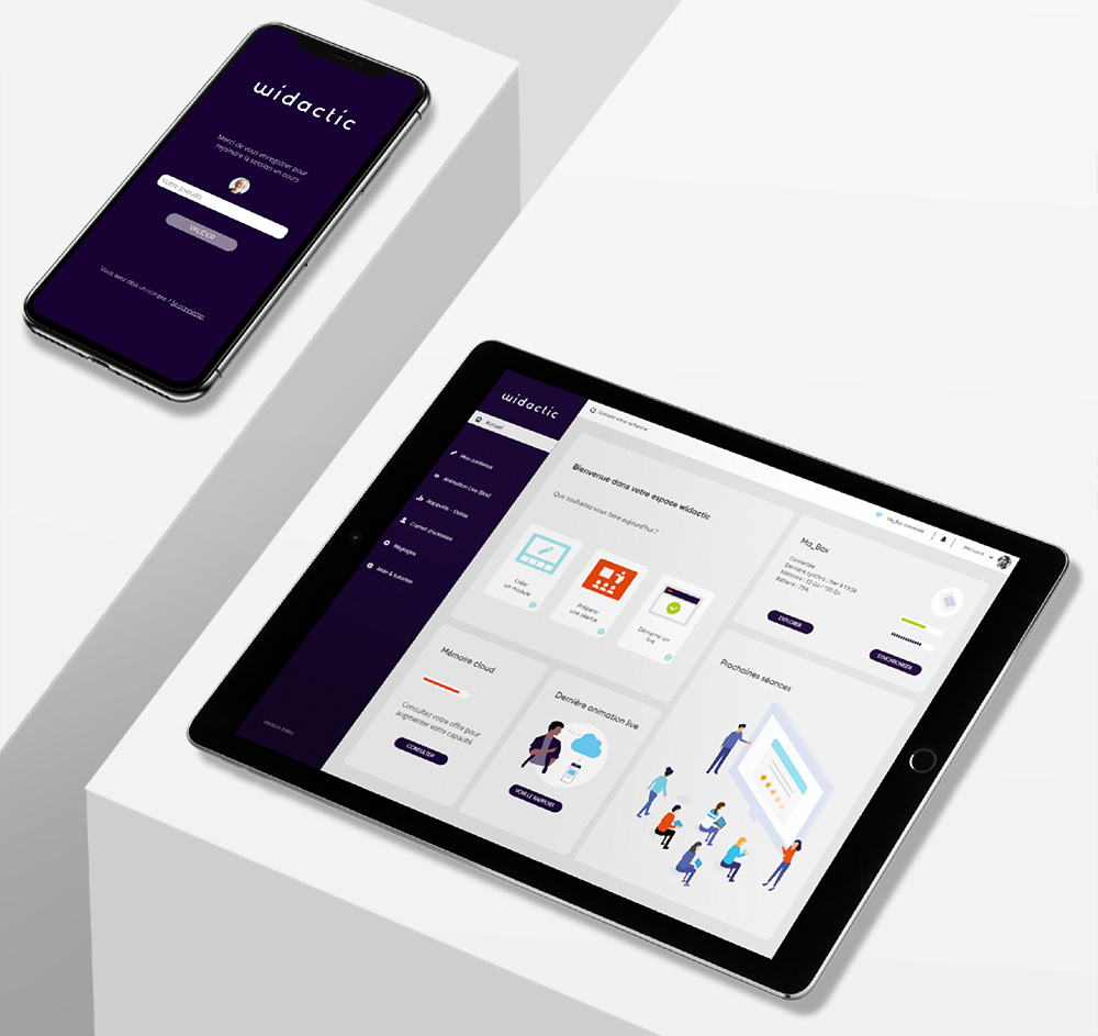
In this global design project, we intervene at different stages of the project: we created a font and the logo as well as the graphic charter of the company, then we also designed the user interfaces of their front and back-office applications, solid with the UX / UI design agency Kumbawa!.
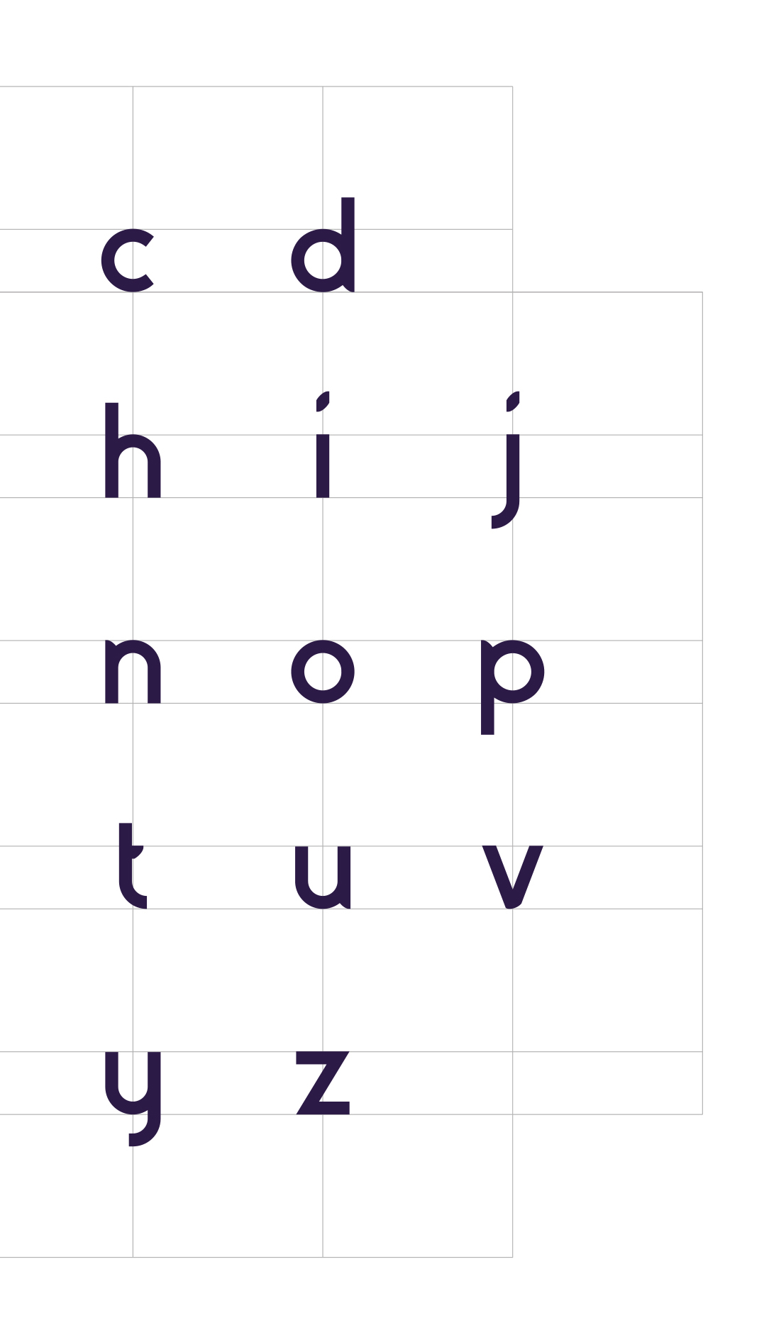
The rounded logo is reassuring. The punctuation elements are like seeds, metaphors of knowledge to be sown. The entire typo is coordinated with this punctuation detail.
In connection, a connected box (Wicom) is being developed, the function of which is to create an ad hoc network in order to facilitate the connection of participants wherever they are, in complete autonomy. This box will be released during the year.
Collaboration since 2019.